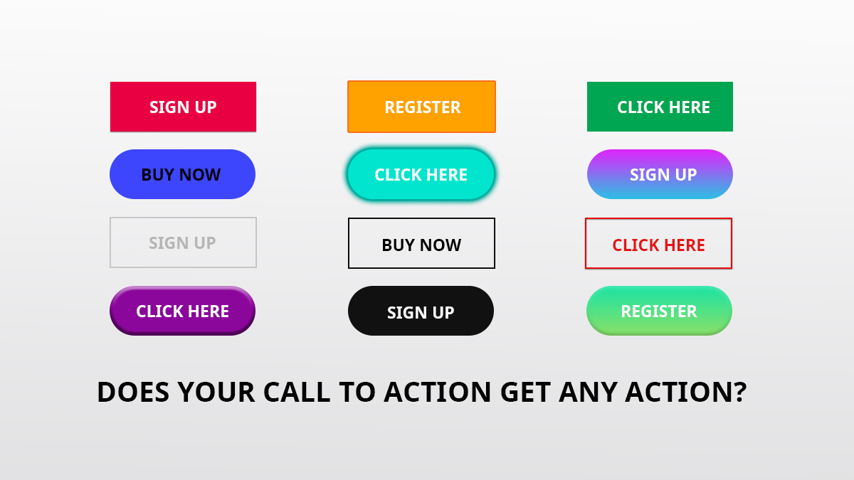
Whether you have a landing page that you are using for generating leads, or an e-commerce website, the power of your add to cart or form submission button is often underestimated. A strong Call to Action (CTA) on your page is extremely important. Your CTA is not only there so that your visitors can easily spot how to purchase or sign up, but it should also be treated as a button that compels visitors to carryout an action.
Marketing Vs Design
There are often conflicts between marketing and design. When you get your website or landing page design you will find that many times the call to action nicely matches and perfectly complements all of the other colors on the website. This may look nice but is not always the best way to get your visitors’ attention. When a button blends in too much, it may not give the since of urgency that you would like it to have.
3 Elements of a Call To Action
- The size – make sure it is bold enough to be seen. You don’t want it to be difficult for your visitors to find where they sign up or how they make a purchase
- The Text – make sure your CTA says what they will get. You want to make sure that your visitors / customers know exactly what they will get, or what will happen when they click on your button.
- Color – whether it is text or a button, the color will have an impact. Many times a contrasting color will help your CTA stand out from the rest of the text on the page.
Test Your Call To Action
When working on your CTAs, doing some A/B testing is always a great way to find out what colors, text, and sizes have a greater impact for your website or landing page visitors. You may be surprised to find that a button color that does not match your color scheme will stand out and get more clicks.
Though a call to action is not the only thing on the page that will get your visitors to submit your form or buy your products, it is a very important piece of the page. You may need to test a few options to find the perfect balance to keep both your designers and marketing managers happy.


